From architecture to workflow Defining architecture, workflow and tools for a large-scale website
Blueprint for the
Optimum platform Blueprint for the Optimum platform

From November 2012 till January 2013, I was hired by Kenzan Media alongside James Paterson and Jason Kuhrt, to work on the blueprint for Cablevision’s new Optimum platform. The project entailed defining the front-end architecture, workflow and the stack of tools to use.
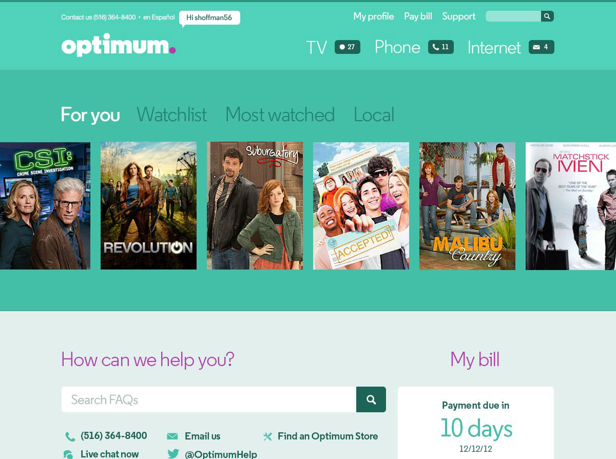
Cablevision, a telecommunications company in the United States, wanted to re-design and re-architect the platform of their brand Optimum. Through Optimum, they offer high-speed internet connections as well as digital cable and phone services. The new platform features a communications center, bill payment and account settings services, among many more functionalities.
Our team of three developers led by Kenzan Media, laid the technical groundwork for the new Optimum website. Together, we defined the front-end architecture, workflow and the stack of tools to use. We took the most significant challenges and figured out solutions for them in a sandboxed prototype environment. The actual production was done by the team at Kenzan Media.
Prototyping
The project started with familiarizing ourselves with the functional requirements created by Kenzan Media, and the wireframes and mockups created by Behavior NY. From the beginning, we focused on the most complicated and important page of the website: the homepage.
To get a clear view on the data to be displayed there, we started speccing this out. The process entailed defining the data displayed on page-load, after page-load and on user-interaction.
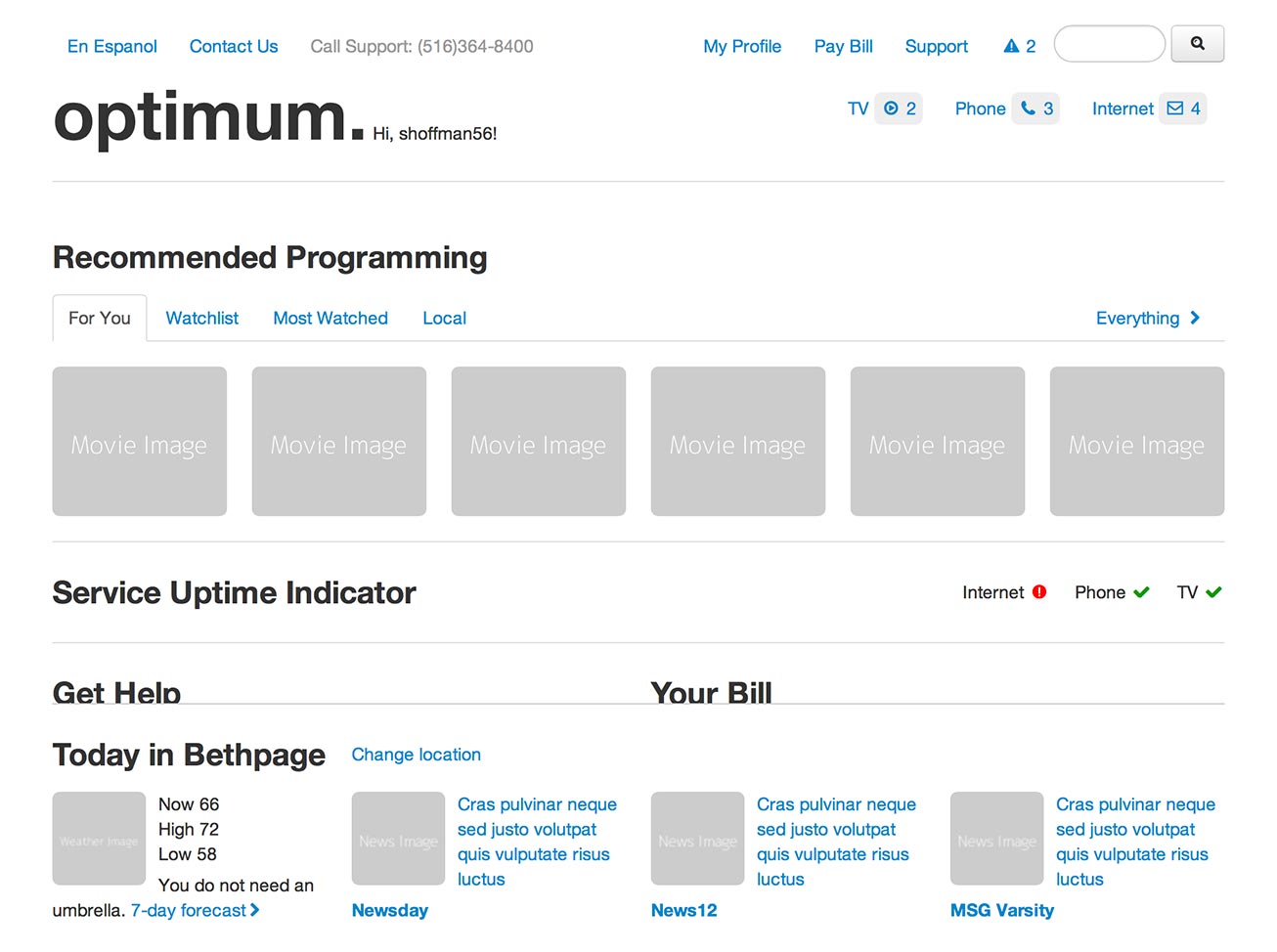
To give everyone involved a better understanding of the layout, behavior and overall experience of the website, James and I build a grey-box prototype based on the requirements and wireframes. Twitter’s Bootstrap, a free toolbox useful for prototyping websites and apps, helped us to speed-up this process. AngularJS was then used to inject the data – which we had specced in the previous step – into the prototype.
The prototype appeared to be really valuable. Besides giving everyone involved an actual feel of the website, it helped us to detect and solve problems at an early stage. It also assisted us in finding the right methodologies to tackle a project of this size. It also proved to be a good playground to test our methodologies in.

CSS Blueprint
The next, rather large step was to decide on the technology stack, workflow and tooling. This was followed by architecting it to the point that it was ready for production.
Together with Jason Kuhrt, I focused on the CSS architecture. We aimed to create a system that was easy to understand and use. It was important that new developers could easily be added to the project without giving them a too steep learning curve. We wanted the documentation to function as a guide on how to write CSS for this project. Clarity and consistency were our guiding principles in this process.
To clarify our decision making, I did some research on subjects like “which web technologies to utilize for implementing fonts into a website” and then collected this information in short-paced documents for everyone to read.
The complete process entailed the following tasks.
- Defining the way of writing the CSS
- Deciding on the use of a CSS preprocessor language
- Defining CSS folder and file structure
- Defining the base styles
- Building a responsive grid
- Defining typographic styles
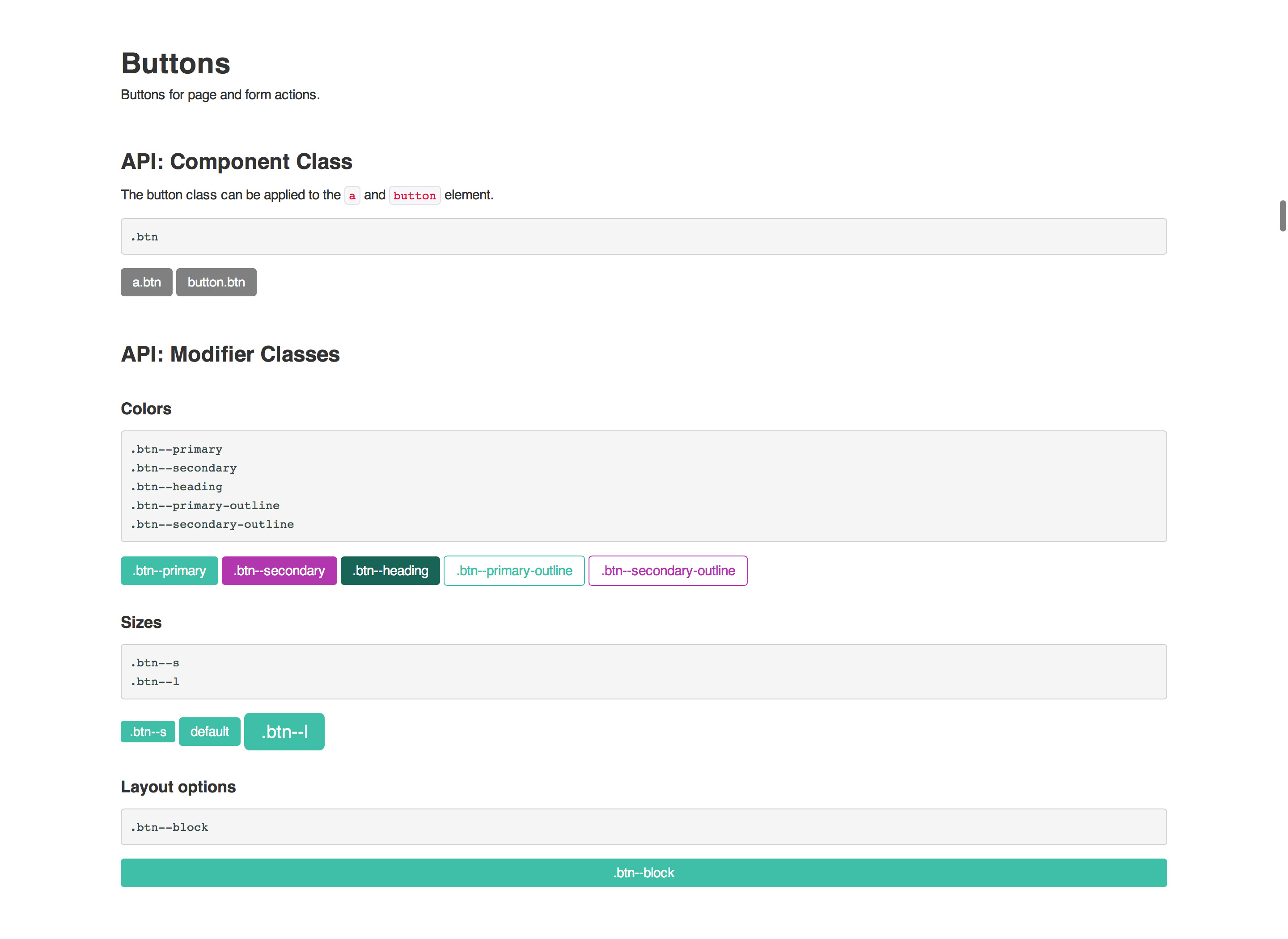
- Building elements (buttons, labels, …)
- Building components (search-, dropdown, …)
- Building pages (homepage,…)
Developer documentation
While working on the CSS side of the project, James Paterson came up with the idea of having the same code-base for the developer documentation as well as the final website. This way of programming had the advantage that the documentation was always up-to-date. It became the sandbox we worked and demoed our foundation of the final technology mix in.

Result
It was rewarding to work on the foundation of a platform with the aim to make the customers’ life easier. Laying the groundwork for a large complicated website as this one, and making it as easy as possible to build and maintain, was an intriguing challenge which I really enjoyed working on.
Working closely together with James Paterson and Jason Kurth has been an absolute pleasure. Besides being true professionals, they are extremely pleasant people work with. It’s a team I wish I had on my side more often.