Minimalistic yet refined A minimalistic yet highly refined showcase
Portfolio for designer
Joakim Jansson Portfolio for designer Joakim Jansson
View Website 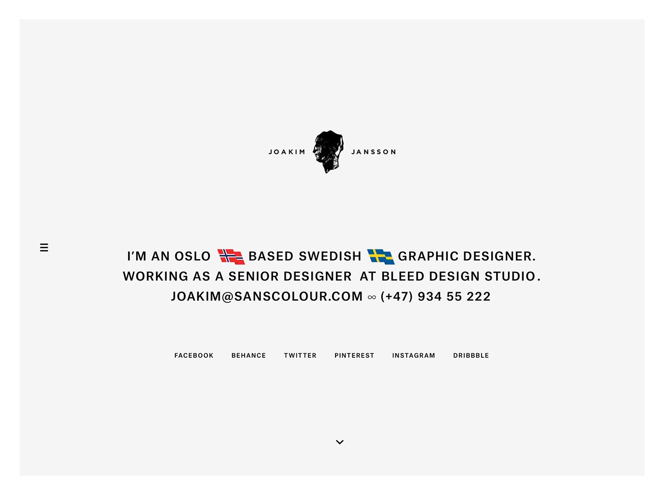
In the summer of 2013, I collaborated with Swedish graphic designer Joakim Jansson on his new portfolio. Together, we created a website that is minimalistic, highly refined, and lets the user easily focus on his work.
With his new website, Joakim Jansson releases new work for other designers, studios and potential clients to see. The website is fully responsive, letting everyone enjoy his work from a wide range of devices.
Process
The process started with Joakim providing me with the design he had in mind: a “single page” layout with a quick access navigation on the side that lists all projects. From the beginning, we worked with actual content to give us a realistic idea of the look and feel of the website. We played with the typography to find the right balance between tone and legibility, which was a subject we discussed a fair amount. We also tested the overall layout on a few devices to see how it functioned and felt.
Once the basic foundation stood, we slowly added more elements to enhance to the page. One of these enhancements was the addition of a subtle parallax effect, which is applied to the top (home) and bottom block (contact) of the page. Together with the expanding side navigation, it gives the website – which overall is fairly static – a more dynamic feel.
For easier viewing, I also added the option to view all the work in gradual steps, by using the up and down arrow-keys. Each step centers a piece of content vertically on the screen. Additionally, clicking/tapping on an image gives that same result.
Responsive design
To accommodate the various devices, the website is build fully responsive. The breakpoints were determined by the content, not by devices. We started with the smallest device and scaled up till the point where we felt that the layout or type needed adjustments. We ended up creating 5 breakpoints to serve the smallest to the largest screens.
In order to deliver images that are appropriate for the device and circumstance, I implemented a responsive images solution. I choose a self-hosted solution over cloud based services like imgix.com, resrc.it or kraken.io. Joakim’s portfolio wasn’t going to be updated on a daily basis. The self-hosted solution allowed us to keep costs low and have everything running from our own server, avoiding any server-side processing on a third party’s server. With the requirements in mind, I ended up choosing foresight.js. It’s a solution that estimates which image to serve based on browser dimensions as well as network connection speed.


Performance
Performance is incredibly important for a truly good user experience. From the get-go, my aim was to make the website perform really well, keeping the overhead as low as possible. This is not easy with a “single page” website with a lot of media. Minification of assets, additional image compression, utilizing data URI’s, a responsive images solution, caching etc. did all contribute to keeping the overhead to a minimum, something which increased the performance dramatically.
Hosting
Since I put so much effort into improving the performance of the website, it only makes sense to also look for a hosting solution that would match this vision. I ended up choosing Amazon’s storage service S3 combined with Amazon’s content delivery network called CloudFront. The latter increases the speed with which the content is delivered to the users.
Technology stack
The core component of the stack is Middleman. It’s a command-line tool for creating static websites using all the shortcuts and tools of the modern web development environment.
The support for solely modern browsers allowed me to write everything in pure Javascript, without being dependent on a library like jQuery.
Responsive images are implemented using foresight.js, as described in the section Responsive Design. The creation of the various dimensions per image is automated using the Grunt task called Responsive Images.
Content management
All content for the website is easily manageable. The creation of the various sizes per image is automated. The textual data is stored in 3 YAML files, which are basically plain text files and very easy to edit. Deploying the site to the server is as simple as executing a single command in the Terminal, thanks to Middleman.
Tracking and sharing
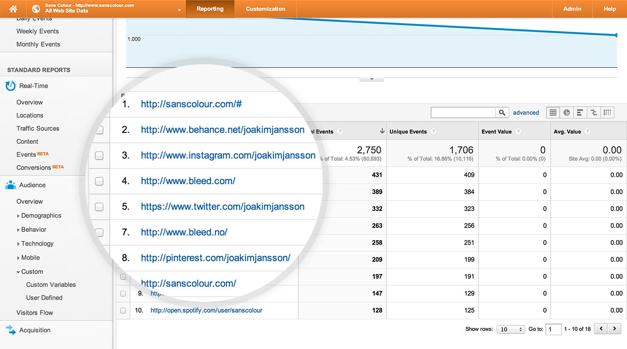
To get clear view on who visits the website, and how they interact on the page, I implemented tracking using Google Analytics. The system tracks all interactions, from which projects are being viewed, till which internal and external links are clicked on. This is valuable information that we will use to further improve the website.
Result
During the whole process, we had many fruitful discussions about type, user experience and workflow. It all contributed to a very fine website that performs well and is really pleasant to use. The website is also easy to maintain and brings out Joakim’s stellar work in the best possible way. A collaborative effort and result with which I’m highly pleased with.