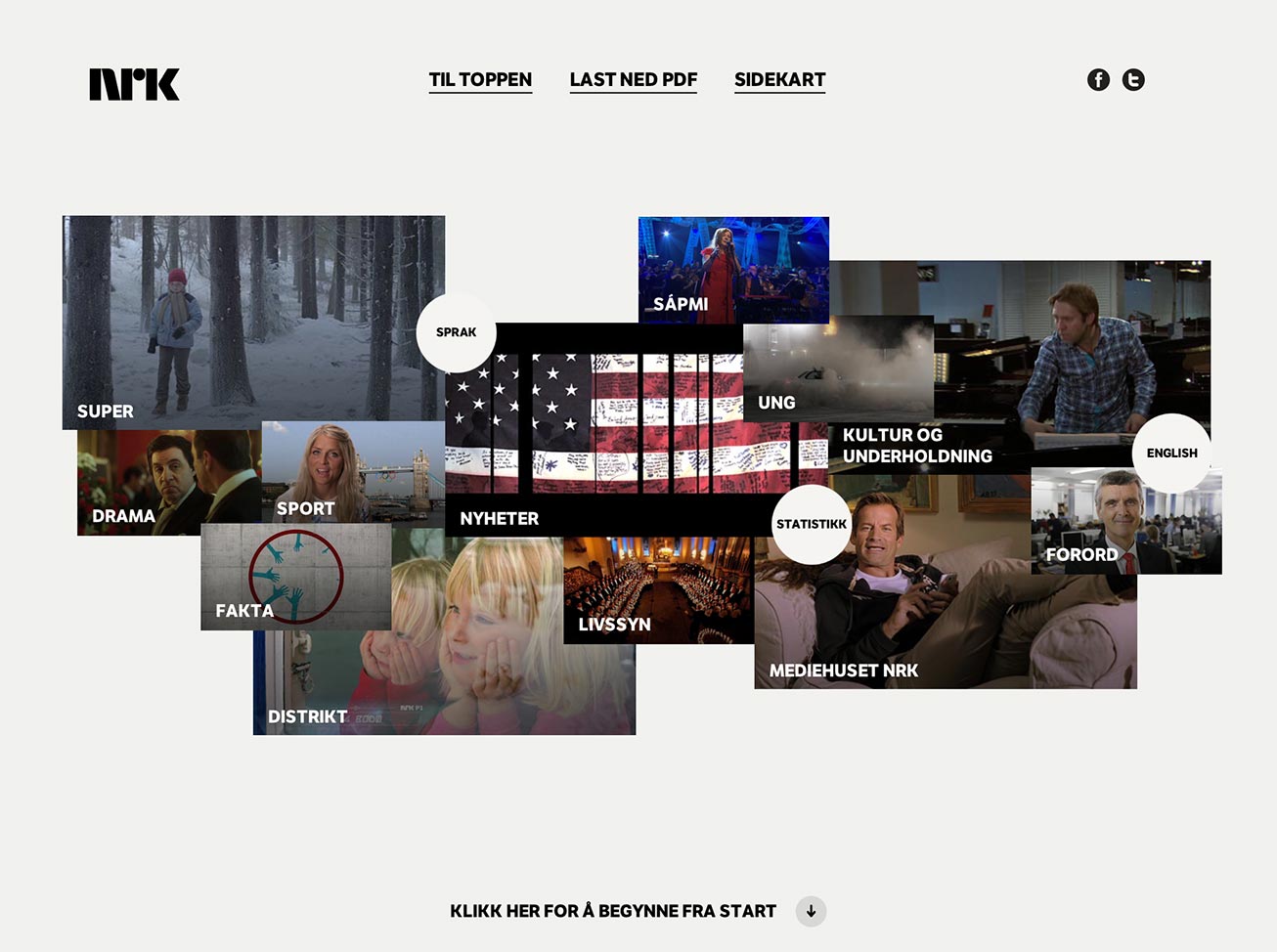
Showcasing the highlights of 2012 The 2012 highlights for Norway’s largest media house
Digital annual report
for the NRK Digital annual report for the NRK
View Website 
Oslo based design studio Bleed asked me to join them in an effort to develop the annual report for broadcasting company NRK. For two months I worked together with designer Kristoffer Lundberg and project manager Marie Steen on location.
NRK, short for Norwegian Broadcasting Corporation, is the government-owned radio and television broadcasting company. The annual report showcases NRK’s highlights for the year 2012, on subjects ranging from “Youth culture” to “Language”.
Navigation
The report consists out of thirteen chapters designed as a “single page” website. The landing page of the report contains a video mosaic, which functions as a table of contents. The user can navigate the report by scrolling vertically to switch chapter and horizontally to go deeper into a chapter. Additionally, there’s also a quick access menu at every page that allows the user to jump directly towards a page within a chapter at any time.
I created a prototype to get a better idea of the functioning of the navigation principle, it’s performance and whether it was pleasant in use. It appeared to be. To make navigating through the content even easier, we implemented the support for navigating by mouse, keyboard arrows as well as touch gestures.
Illustrating the bi-directional navigation principle. The user can navigate vertically to switch chapters, and navigate horizontally to view all pages within a chapter.
A modular approach
The report is designed with modularity in mind. This approach made it possible to give each chapter its own layout, but still use the same set of modules. Since we only received the content of the first chapter at the start, it also gave us a certain flexibility in laying out all content for the other twelve chapters.
Technology stack
We were aware that the site was going to be content heavy. It therefore made sense to setup a workflow that made the insertion of content as easy and fast as possible. Since the content wasn’t going to change after release, I looked into the use of static site generators. Docpad came out as the most fitting solution. It was well maintained, had a large catalogue of plugins and matched all other requirements, one of which was the support for partials. This allowed me to develop the modules individually in their own sandbox before implementing them throughout the website.
Result
The result is a well designed report with a rather refreshing art-direction. Within the given boundaries, we managed to deliver something substantial. As a whole, it’s informative, has a bright outlook and is pleasant in use.
It also gave me the opportunity to meet the very fine people behind Bleed. I always enjoy seeing how different studios operate on a daily basis.
